Application Usage Reports using Grafana and MySQL
Application usage data on macOS can easily be misinterpreted. Even the native Screen Time service does not do a great job determining which applications were truly ‘in use’ and for how long. More on this here: Spelunking macOS ScreenTime App Usage with R.
Please see my other blog post regarding the JamfDaemon and application usage collection: Shallow Diving macOS Application Usage Logs with Jamf Pro.
Jamf Pro does have the ability to display application usage reports using the web app, however, there is no option (at the time of writing) to export usage reports, and manipulating or visualizing the data in a meaningful way is not really possible. Generating reports is slow as the database is queried heavily to populate the resulting data.
The Jamf Pro Classic API includes a computerapplicationusage endpoint resource that can be utilized. This would mean iterating through each device record to collect application usage. It’s not the most efficient method, albeit the easiest. Splunk and Power BI are both options to consider for making use of the Jamf Pro API, but as our organization was already using Grafana, it was worth investigating what could be done.
Grafana works best with time series data but can also be used to evaluate table-based data and display a wide variety of visualizations.
Data Accuracy#
The accuracy of the data collected by the JamfDaemon is close enough for what we need. If you are collecting data from devices with multiple full screen applications, multiple logged-in users, external displays, and remote sessions active, then your results may vary. For our organization’s needs, we really just required a holistic overview of app usage so we could compare, for example, Slack vs Microsoft Teams, and determine app popularity and trending over time.
Application Query#
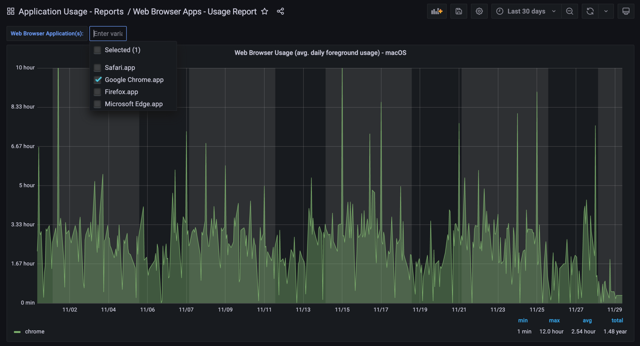
The following MySQL query joins the application_usage_logs table with the application_details table. This gives us a resulting table that includes minutes_foreground data and the corresponding application name (e.g., Google Chrome.app). I also used a Grafana variable to select the application I was interested in ($browser_applications).
SELECT application_usage_logs.usage_date_epoch as time,
       avg(application_usage_logs.minutes_foreground) as chrome
FROM application_details
INNER JOIN application_usage_logs
  ON application_details.id = application_usage_logs.application_details_id
WHERE name = 'Google Chrome.app'
  AND minutes_foreground > 0
  AND minutes_foreground < 1440
  AND "${browser_applications}" LIKE '%Google Chrome.app%'
GROUP BY time
ORDER BY time
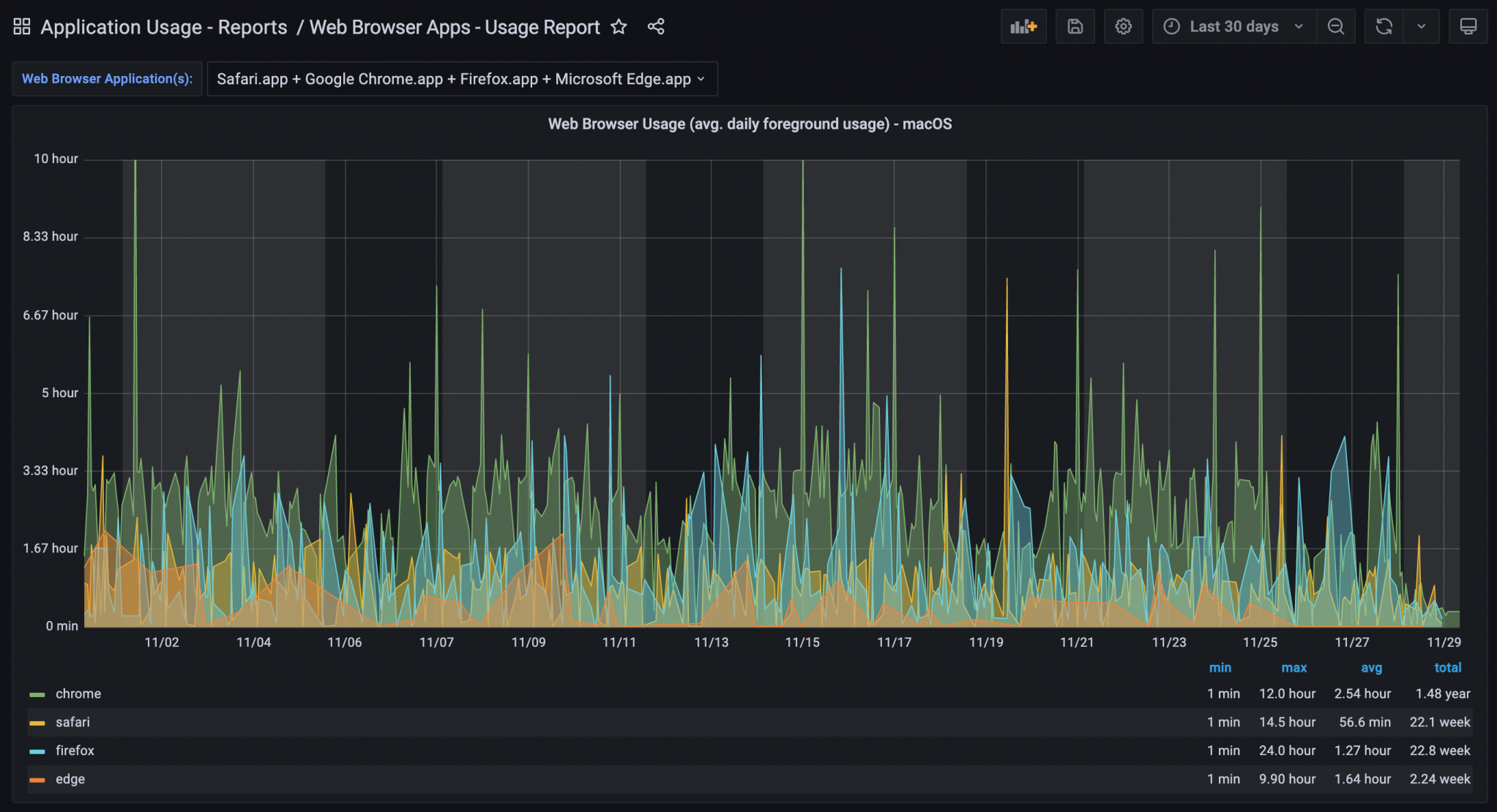
Browser Usage Details – All Devices (30 days)
It was necessary to use one query per application in order to display the time data all on one graph – so four browsers = four separate queries. The $browser_applications variable took care of only displaying usage of the browser selected in the variable drop-down selector.
Browser Usage Details – All Devices (Chrome, 30 days)
Per-Device Usage Query#
Visualizing application usage data on a per-device basis is also possible. Here is the query I developed for that:
SELECT usage_date_epoch as time_sec,
       minutes_foreground,
       computer_name
FROM computers_denormalized
INNER JOIN application_usage_logs
  ON computers_denormalized.computer_id = application_usage_logs.computer_id
INNER JOIN application_details
  ON application_usage_logs.application_details_id = application_details.id
WHERE name = "${application}"
  AND computer_name = ${device}
  AND minutes_foreground > 0
  AND minutes_foreground < 1440
Again, using Grafana variables, I was able to select the application name and then a device name. This then displays the time series data for that
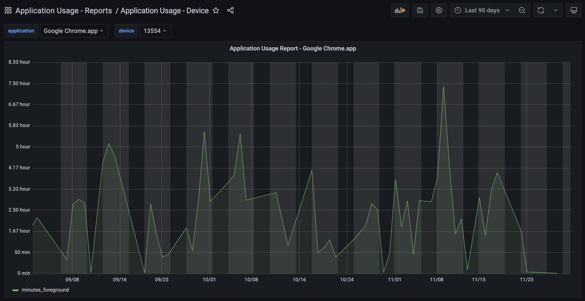
Browser Usage Details – Single Device (Chrome, 30 days)